###How can I plot netcdf data using python?
I’ve gotten this question a bunch of times in the past year so I figured it would be easiest if I put this up as a blog post. A few things before we get started.
- netCDF is just a storage format. Before you can do any plotting with in, you need to unpack the data. The current tool in Python to do this is the netCDF4 package
- Use
ncview. ncview is the quickest way to visually examine a netcdf file and while it wont give you publishable images, it is a great tool for initial analysis. - For georeferenced data, use the matplotlib.basemap module.
- Use the existing documentation. There are a ton of good examples on how to plot using matplotlib and Basemap. Here I’ll show one very basic example but there are many more options for overlays, projections, colormaps, etc.
Reading netCDF data using Python
As I noted above, before we can do any plotting, we need to unpack the data. To do this, we use the Dataset class of the netCDF4 module.
from netCDF4 import Dataset
import numpy as np
We start by opening the file that contains the variables we want to eventually plot. fh becomes the file handle of the open netCDF file, and the ‘r’ denotes that we want to open the file in read only mode.
my_example_nc_file = '/Users/jhamman/Desktop/my_example_nc_data.nc'
fh = Dataset(my_example_nc_file, mode='r')
Now we can read the data from any of the variables contained in fh. For this example, we’ll just read the coordinate variables (lat, lon) and the Tmax variable. This puts each of these variables into numpy arrays.
lons = fh.variables['lon'][:]
lats = fh.variables['lat'][:]
tmax = fh.variables['Tmax'][:]

tmax_units = fh.variables['Tmax'].units
Finally, it is good form to close the file when you are finished.
fh.close()
At this point, if you need to do any analysis on the data (i.e. get the statistics), you can use numpy/scipy to do so.
Plotting georeferenced data using Python
Now that we have our data in numpy arrays, we can move forward, using Python and Matplotlib to plot our data.
import matplotlib.pyplot as plt
from mpl_toolkits.basemap import Basemap
Next, we setup a Basemap instance, specifying our desired map and projection settings.
# Get some parameters for the Stereographic Projection
lon_0 = lons.mean()
lat_0 = lats.mean()

m = Basemap(width=5000000,height=3500000,
            resolution='l',projection='stere',\
            lat_ts=40,lat_0=lat_0,lon_0=lon_0)
When we give this Basemap instance our coordinate variables, it returns our plotting coordinates. This is how basemap knows where to put our projected data on the map.
# Because our lon and lat variables are 1D,
# use meshgrid to create 2D arrays
# Not necessary if coordinates are already in 2D arrays.
lon, lat = np.meshgrid(lons, lats)
xi, yi = m(lon, lat)
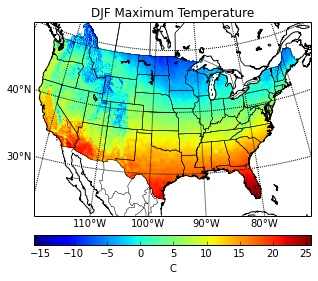
Now, we can plot the data using one of the available plot types (pcolor, pcolormesh, contour, contourf, scatter, etc.). Here we use pcolor. Gridlines, colorbars, and axis labels can also be added at this point.
# Plot Data
cs = m.pcolor(xi,yi,np.squeeze(tmax))

# Add Grid Lines
m.drawparallels(np.arange(-80., 81., 10.), labels=[1,0,0,0], fontsize=10)
m.drawmeridians(np.arange(-180., 181., 10.), labels=[0,0,0,1], fontsize=10)

# Add Coastlines, States, and Country Boundaries
m.drawcoastlines()
m.drawstates()
m.drawcountries()

# Add Colorbar
cbar = m.colorbar(cs, location='bottom', pad="10%")
cbar.set_label(tmax_units)

# Add Title
plt.title('DJF Maximum Temperature')

plt.show()
There are, of course, many more options and variations to plotting with Maplotlib and Basemap. The Basemap examples page includes a nice handful of different plot configurations.